Global parameters
Global parameters allow you to specify global parameters and global lists which can be used as parameters for object displays. To tell an object display parameter to use a global parameter, select "global" as the parameter type.
Default global parameters and lists
atvObjectDisplays
The following global lists allow to change the appearance of alarm list, history list and tables.
Alarmlist – This global list allows to modify the columns shown in the respective alarm list view (alarms, all, alarmlog, disabled, shelved, suppressed). The following columns are defined by default:
alignmentMain – Defines the text alignment
columnName – Name of the column
field – Field name delivered to the table
filter – Defines if filtering is enabled for this column
filterCheck – Checkbox that allows to switch the filter mode
fontSizeDetail – Font size of detail view
fontSizeMain – Font size of table
orderDetail – Order of elements displayed in the detail view
orderMain – Order of table columns
priority – Priority in size dependent view
sortable – Column is sortable
textoption – Style of the content (text):
normal
italic
small-caps
bold
bold-italic
bold-small-caps
bolder
bolder-small-caps
lighter
lighter-italic
lighter-small-caps
type – Type of the column. Available options:
datetime ("datetime, s" to hide milliseconds)
localized (to correctly show LocalizedText)
number ("number, <digits>", to define the number of decimal places, e.g. number, 3)
string
visibleDetail – Visibility in detail view
visibleMain – Visibility in main view
widthMain – Column width
CustomButtonsMenu – This global list defines the alarm button in the control panel:
iconAlignment
iconClass
order
target
text
trigger
ElementMenu – This global list contains the start index and step size for menu entries (see Quick Dynamic element menu).
Historylist – This global list allows to modify the columns shown in the history list. The following columns are defined by default:
alignmentMain – Defines the text alignment
columnName – Name of the column
field – Field name delivered to the table
filter – Defines if filtering is enabled for this column
filterCheck – Checkbox that allows to switch the filter mode
orderDetail – Order of elements displayed in the detail view
orderMain – Order of table columns
priority – Priority in size dependent view
sortable – Column is sortable
textoption – Style of the content (text):
normal
italic
small-caps
bold
bold-italic
bold-small-caps
bolder
bolder-small-caps
lighter
lighter-italic
lighter-small-caps
type – Type of the column. Available options:
datetime ("datetime, s" to hide milliseconds)
localized (to correctly show LocalizedText)
number ("number, <digits>", to define the number of decimal places, e.g. number, 3)
string
visibleDetail – Visibility in detail view
visibleMain – Visibility in main view
widthMain – Column width
RecipeManager – Allows to modify the columns shown in the Recipe Manager
recipe_editor
Columns
columnName – Name of the column
field – Field name delivered to the table
filter – Defines if filtering is enabled for this column
orderMain – Order of table columns
sortable – Column is sortable
visibleMain – Visibility in main view
widthMain – Column width
recipe_manager
ParameterColumns
columnName – Name of the column
field – Field name delivered to the table
filter – Defines if filtering is enabled for this column
orderMain – Order of table columns
sortable – Column is sortable
visibleMain – Visibility in main view
widthMain – Column width
Recipe_Columns
columnName – Name of the column
field – Field name delivered to the table
filter – Defines if filtering is enabled for this column
orderMain – Order of table columns
sortable – Column is sortable
visibleMain – Visibility in main view
widthMain – Column width
recipe_picker_table
ParameterColumns
columnName – Name of the column
field – Field name delivered to the table
filter – Defines if filtering is enabled for this column
orderMain – Order of table columns
sortable – Column is sortable
visibleMain – Visibility in main view
widthMain – Column width
Recipe_Columns
columnName - Name of the column
field – Field name delivered to the table
filter – Defines if filtering is enabled for this column
orderMain – Order of table columns
sortable – Column is sortable
visibleMain – Visibility in main view
widthMain – Column width
recipe_template_editor
Columns
columnName – Name of the column
field – Field name delivered to the table
filter – Defines if filtering is enabled for this column
orderMain – Order of table columns
sortable – Column is sortable
visibleMain – Visibility in main view
widthMain – Column width
recipe_template_manager
ParameterColumns
columnName – Name of the column
field – Field name delivered to the table
filter – Defines if filtering is enabled for this column
orderMain – Order of table columns
sortable – Column is sortable
visibleMain – Visibility in main view
widthMain – Column width
Recipe_Columns
columnName – Name of the column
field – Field name delivered to the table
filter – Defines if filtering is enabled for this column
orderMain – Order of table columns
sortable – Column is sortable
visibleMain – Visibility in main view
widthMain – Column width
Tables – This global list allows to edit the colors of a table's footer, header, border, etc.
detail_cell_color – Background color for unfolded detail information
detail_text_color – Text color for unfolded detail information
footer_cell_color – Background color for footer
footer_text_color – Text color for footer
footer_mode_color – Color for mode informations
header_border_color – Color of the header border
header_cell_color – Background color for header, slider (scrollbar), custom filter, status bar
header_text_color – Text color for header, slider background (scrollbar), custom filter, status bar
hover_cell_color – Background color for hovered cells
hover_text_color – Text color for hovered cells
row_border_color – Color of the row border
row_cell_color_even – Background color for even rows
row_cell_color_odd – Background color for odd rows
row_text_color_even – Text color for even rows
row_text_color_odd – Text color for odd rows
scrollbar_color – Color for scroll bar
scrollbar_thumb_color – Color for scroll bar thumb
selection_cell_color – Background color for selected rows
selection_text_color – Text color for selected rows
table_icon_color – Color for table icons
Global parameters for advanced object displays
atvise provides the following global parameters and lists that can be used to change the appearance of advanced-style object displays.
atvAccent1 – Bar color and pointer color (e.g. for horizontal/vertical bar, slider, clock, gauge); default value: #f2d600
atvAlarmIndication – This global list defines how the alarm states ("On unacknowledged", "On acknowledged", "Off unacknowledged" and "Off acknowledged") are displayed. The following columns are defined:
key – Name matches the respective alarm state
color
description
fillColor
fillFlashinterval
fontColor
fontFlashInterval
interval
atvBorderColor – Border color for object displays; default value: #d7d7d7
atvBorderColor2 – Border color for layout element buttons (alarmlog (small), custom (small), favorites (small)); Default value: #ffffff
atvFillColor – Fill color for object display's backgrounds and buttons; default value: #e5e5e5
atvFillColor2 – Fill color for context menus, popups or active elements (like clicked buttons); default value: #575757
atvFontColor – Font color for texts and labels; default value: #575757
atvFontColor2 – Font color for context menus as well as for texts, labels and symbols of active elements; default value: #ffffff
atvInactiveColor – Fill color for bars or buttons of inactive elements; default value: #b7b7b7
atvStatusIndication – This global list defines how status indications are displayed. The following columns are defined:
key – Name matches the respective status indication
color
description
fillColor
fillFlashinterval
fontColor
fontFlashInterval
interval
atvSymbolColor – Color for symbols of buttons, e.g. rocker switch, login button etc.; default value #575757
You can adapt these parameters or add elements to the global lists by double-clicking the respective element in the tree. If you want to create new parameters or lists proceed as follows:
Adding a global parameter
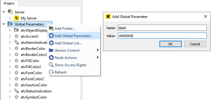
Adding a global parameter
Right-click Global Parameters.
Click to add a new global parameter.
Fill in a name and a value for the new global parameter. You can also use the color picker to select a color as the value.
Press OK to save the new parameter.
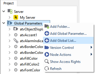
Adding a global list
Global lists allow you to define lists containing pairs of keys and values.
Right-click Global Parameters.
Click to add a new global list.
Adding a global list
Choose a name for the global list.
Define the entries for the global list. Each entry consists of a key and a value. You can define the value columns using the configuration table. See steps 5 and 6.
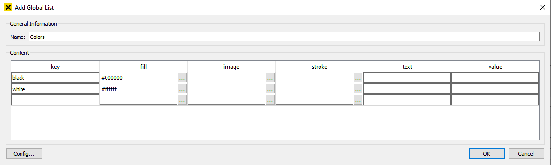
Defining a global list
To open the configuration table, click the button Config… at the bottom left corner.
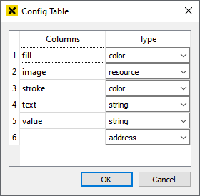
Configuration of a global list
The configuration table allows you to specify different value types for the global list. Each row in the configuration table corresponds to one column in the global list definition (except the key column).
You may select different types for each column. The possible types are:
address
resource
resource.image
string
number
bool
color
Using global parameters
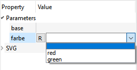
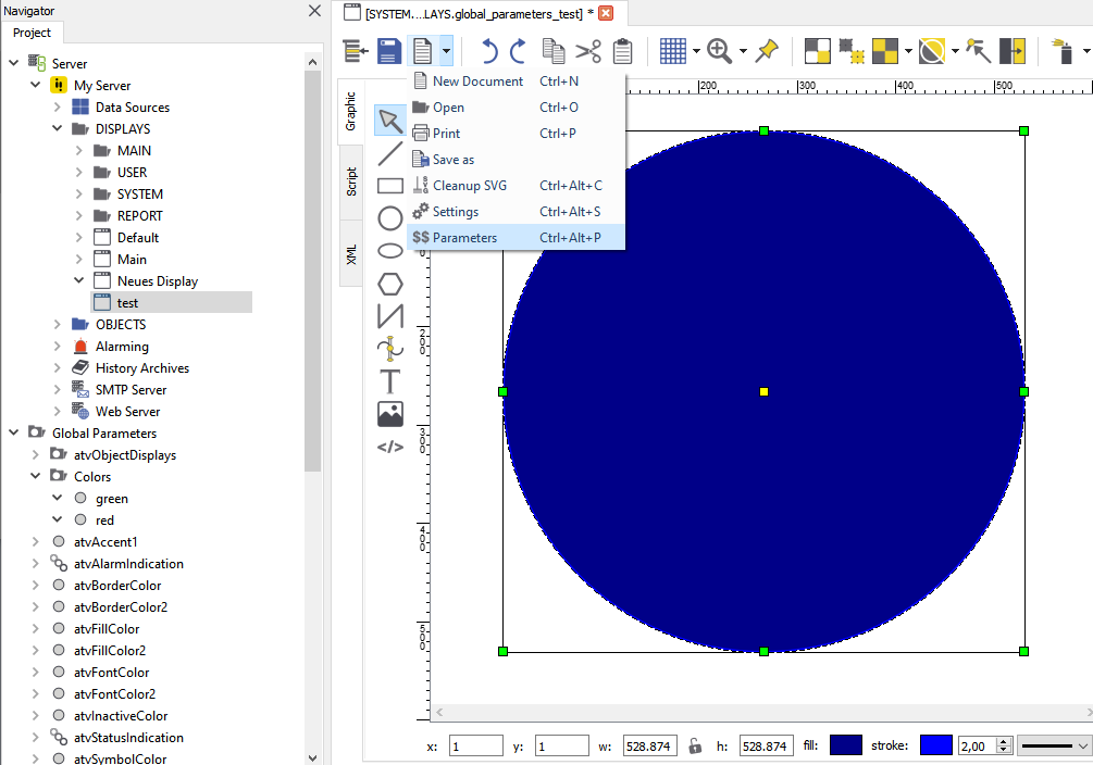
Create a display "global_parameters_test" at Library ‣ PROJECT ‣ Object Displays. Open the display and draw a circle. Fit the display dimensions to the circle.
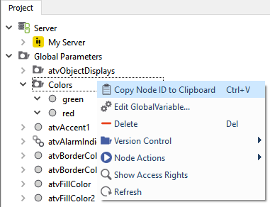
Now right-click Global Parameters in your project tree on the left and create a folder "color" containing some global parameters. E.g.: red, green,…
Right-click your folder and copy the NodeID to the clipboard.
Open the display parameter window in the display you drew the circle.
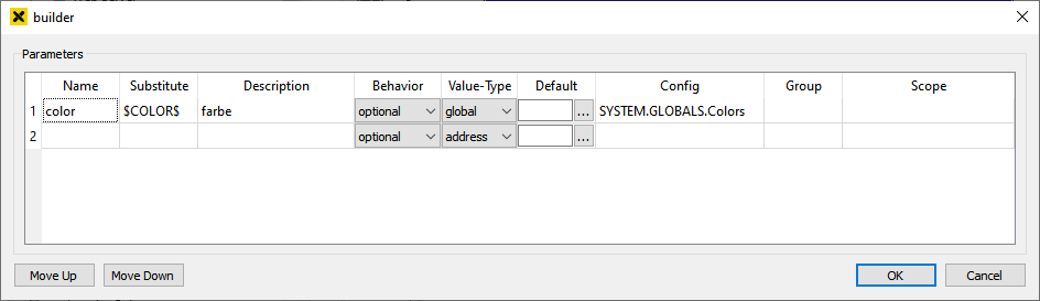
Enter a name for the parameter and define a substitute beginning and ending with a "$". E.g.: $COLOR$.
Enter a description for your parameter.
Choose the value type "global" from the drop-down list.
First double-click and then right-click in the field "Config" do paste the NodeID of your global parameter, which you copied to the clipboard before.
Set your substitute as fill value for the circle.
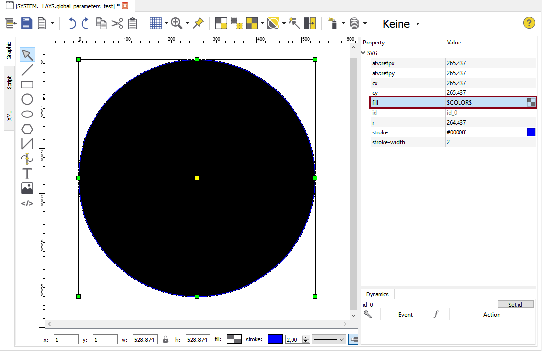
Save your display and drag it from the tree to another open display and choose your global parameter from the dropdown list in the attributes area.