Navigation
The navigation bar extends the Advanced library to display a menu structure. This menu structure can either be mapped automatically from the existing display structure or alternatively from a user-defined structure.
Attention
The use of the quick dynamic with the same name is no longer recommended as of atvise 3.4.1. Likewise, new navigation quick dynamics can no longer be added to displays in the atvise builder!
The navigation bar consists of the following main components:
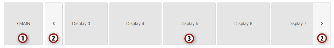
home element
navigation elements
menu items
Conditions
To display symbols, the navigation bar uses parts of the Font Awesome library of version 5.11.2 (https://fontawesome.com/) which is available under a free license.
Hint
In order to display hover effects, the hover detection must be natively supported by the browser (device) on which the navigation is carried out. This support is known to be limited on multitouch devices such as tablets and mobile phones.
Core functions
Illustration of a horizontal or vertical menu structure
Automatic generation of the menu from the existing display structure
Hide and show the navigation bar
Optional custom menu
Components
The resources consist of the display navigation, the quick dynamic Navigation and the provided Font Awesome resources.
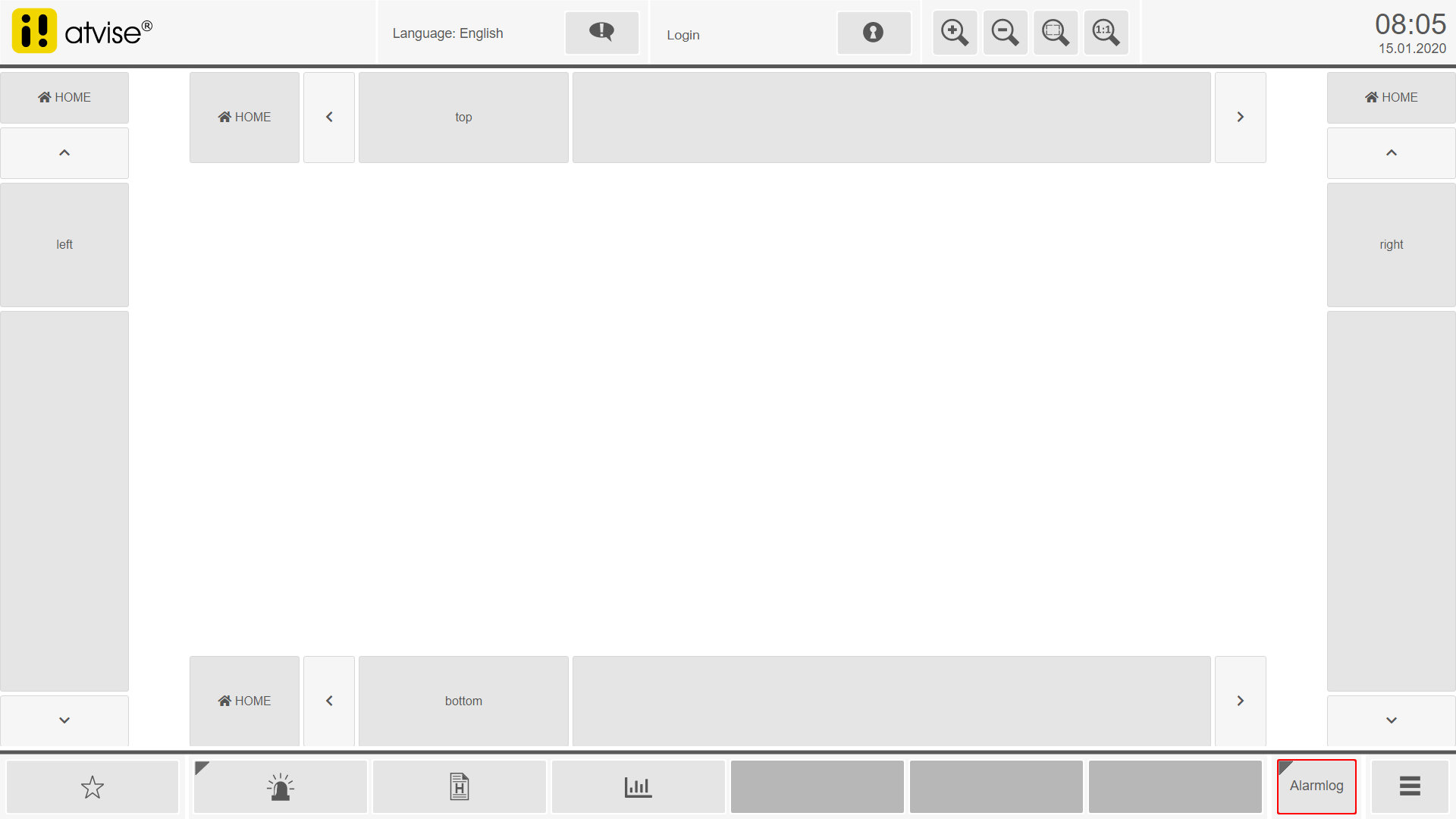
Display "navigation"
The navigation display can be used to create horizontal and vertical navigation bars.
Usage
The object display can be freely positioned in any display. The size and positioning correspond to the set dimensions. The display parameters are used to align and set the displayed content.
Alignment and layout
The "bottom", "left", "top" and "right" positions are available for aligning the navigation. These positions correspond to the docking positions on the corresponding screen edge.
The height and width of the elements in the navigation bar is determined by their orientation. With horizontal alignments (bottom, top), the height of the elements is fixed and their width is variable. With vertical alignments (left, right) the height of the elements is variable and the width is fixed.
The height and width of active and inactive menu items can be defined relative to the fixed size of the navigation element.
Parameters
Below are the parameters of the navigation object display.
In addition to the general parameters, the other parameters are divided into groups that summarize the functionality or the display of an element in the menu.
- General parameters
The following parameter is used to clearly identify the navigation bar.
General parameters¶ Name
Type
Description
navigation id
String
Unique identification of the menu (default: navigation_1)
- Custom menu
This parameter group contains the parameters for custom menus. The title and display parameters are available for creating simple menus. To create complex menus, the structure can be passed directly as a JSON string.
Hint
All of these parameters support the one-time initialization of the menu structure – a structure change at runtime is not recognized.
Hint
A display must not be used more than once in the entire menu structure.
Group parameters¶ Name
Type
Description
menu item n title
String (HTML)
Title of the menu item (HTML allowed)
menu item n display
Display
Display to open when clicking on the menu item
menu from JSON string
String (JSON)
For a description see Creation of a custom menu
menu from trigger
String
Trigger which transmits the menu structure to be created (as JSON) to the navigation. This allows the menu structure to be filled once, after the object display is loaded.
entry point
Display
If only part of the menu should be visible, an entry point (display or folder) can be defined here
- Appearance: general
This parameter group contains the general parameters of the navigation and the common layout settings of the elements. Important parameters of this group are the orientation of the navigation, visibility after initialization and animation settings.
The group also contains parameters for the general layout such as frame settings and the distance between the elements.
Group parameters¶ Name
Type
Description
alignment
ENUM
Docking position of the navigation (default: right)
visibility
Boolean
Visibility when activated (default: true)
animation
ENUM
Animation when the visibility changes (default: fade)
animation speed
Number
Factor for adjusting the animation speed. To increase the animation speed, the factor has to be increased (default: 1)
menu background color
Color
Background color of the navigation area that contains the menu
menu border color
Color
Border color of the navigation area that contains the menu (default: global parameter atvBorderColor)
menu border width
Number (Pixel)
Frame thickness of the navigation area that contains the menu (default: 0)
menu border style
ENUM
Frame style of the navigation area that contains the menu (default: solid)
item border colors
Color
Border color of the elements in the navigation area (default: global parameter atvBorderColor)
item border radius
Number (Pixel)
Rounding off the frame of the elements in the navigation area (default: 3)
item border width
Number (Pixel)
Frame thickness of the elements in the navigation area (default: 1)
item border style
ENUM
Frame style of the elements in the navigation area (default: solid)
item padding
Number
Distance between the elements in the navigation area (default: 5)
- Appearance: home element
This parameter group contains the settings of the home element. Important parameters of this group are the visibility of the home element, the title displayed in the home element and the display that can be opened by clicking on the home element. This group also contains parameters for the alignment, colors and size of the home element.
Group parameters¶ Name
Type
Description
visibility
Boolean
Visibility of the home element (home button) (default: true)
title
String (HTML)
Title displayed in the home element (default: HOME)
display
Display
Display which should be opened by clicking on the home element. By default, this is the atvise scada specific display
AGENT.DISPLAYS.Main. If you use the navigation bar with a webMI server, select an according display of this webMI server.horizontal alignment
ENUM
Horizontal alignment of the content in the home element (default: center)
vertical alignment
ENUM
Vertical alignment of the content in the home element (default: middle)
background color
Color
Background color of the home element (default: global parameter atvFillColor2)
font color
Color
Font color of the content of the home element (default: global parameter atvFontColor2)
height in vertical layouts
Number (Pixel)
Height of the home element in vertical layouts (default: 73)
width in horizontal layouts
Number (Pixel)
Width of the home element in horizontal layouts (default: 150)
icon visibility
Boolean
Visibility of the symbol in the home element (default: true)
- Appearance: navigation element
This parameter group contains the settings of the navigation elements for scrolling in the navigation content. The parameters include options for colors and sizes.
Group parameters¶ Name
Type
Description
visibility
Boolean
Visibility of the navigation elements in the navigation (default: true)
horizontal alignment
ENUM
Horizontal alignment of the content in the navigation element (default: center)
vertical alignment
ENUM
Vertical alignment of the content in the navigation element (default: middle)
background color
Color
Background color of the navigation elements (default: global parameter atvFillColor2)
font color
Color
Color of the symbols in the navigation element (default: global parameter atvFontColor2)
height in vertical layouts
Number (Pixel)
Height of the navigation elements in vertical layouts (default: 73)
width in horizontal layouts
Number (Pixel)
Width of the navigation elements in horizontal layouts (default: 73)
- Appearance: menu items
This parameter group contains the settings for the menu items. In addition to the options for colors, relative sizes for the menu items can also be defined here.
The number of visible menu items can also be defined here. The calculation is based on the orientation of the navigation. If the parameter "number of menu items" is set to 0, the values for height and width are taken from the dimensions of the object display and the parameters for heights and widths.
Group parameters¶ Name
Type
Description
number of menu items
Number
Number of displayed menu items in the navigation. If the value is specified, the optimal width / height is determined automatically. 0 deactivates the calculation. (default: 4)
horizontal alignment
ENUM
Horizontal alignment of the content in a menu item (default: center)
vertical alignment
ENUM
Vertical alignment of the content in a menu item (default: middle)
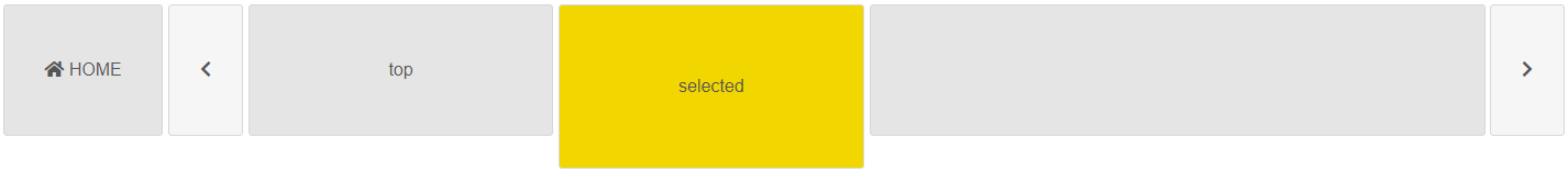
background color active
Color
Background color applied for active menu items (default: global parameter atvAccent1)
background color hovered
Color
Background color applied to menu items on mouseover (default: global parameter atvFillColor)
background color inactive
Color
Background color applied to inactive menu items (default: global parameter atvFillColor2)
height in vertical layouts
Number (Pixel)
Height of menu items in vertical layouts if the automatic calculation has been deactivated (default: 132)
width in horizontal layouts
Number (Pixel)
Width of menu items in horizontal layouts if the automatic calculation has been deactivated (default: 200)
percent height / width active
Number (Percent)
Relative size of active menu items (default: 100)
percent height / width inactive
Number (Percent)
Relative size of inactive menu items (default: 80)
- Appearance: icons
This parameter group contains the settings of the displayed symbols. Symbols are defined as HTML text. Therefore, in addition to the Font Awesome symbols, text or graphics (<img/> tag) can also be specified.
Group parameters¶ Name
Type
Description
home
String (HTML)
Icon for the home element (default: <i class="fas fa-home"></i>)
arrow down
String (HTML)
Icon for the navigation arrows down (default: <i class="fas fa-chevron-down"></i>)
array left
String (HTML)
Icon for the navigation arrows to the left (default: <i class="fas fa-chevron-left"></i>)
array right
String (HTML)
Icon for the navigation arrows to the right (default: <i class="fas fa-chevron-right"></i>)
array up
String (HTML)
Icon for the navigation arrows up (default: <i class="fas fa-chevron-up"></i>)
open menu
String (HTML)
Icon for opening menu items if they contain a submenu (default: <i class="fas fa-caret-right"></i>)
close menu
String (HTML)
Icon for closing the menu item after entering a submenu (default: <i class="fas fa-caret-left"></i>)
- Font
This parameter group contains the settings of the font used in the menus.
Group parameters¶ Name
Type
Description
font family
String (HTML)
The font family that is applied to all menu elements (default: Arial)
font color active
Color
The font color that is applied to active menu items (default: global parameter atvFontColor)
font color hovered
Color
The font color that is applied to hover menu items (mouseover) (default: global parameter atvFontColor)
font color inactive
Color
The font color that is applied to inactive menu items (default: global parameter atvFontColor2)
font size
Number (Pixel)
The font size that is applied to all menu elements (default: 16)
- Options
This parameter group contains further settings that do not affect the layout.
Group parameters¶ Name
Type
Description
id of the content frame
String
ID of the content frame in which the display is to be opened when a menu item is selected (default: content)
minimum z-Index
Number
Minimum z-index with which the navigation should be initialized (default: 3000)
scroll factor
Number
Factor for adjusting the speed of the mouse wheel for scrolling within the navigation (default: 100)
scroll factor mobile
Number
Factor for adjusting the speed of the touch recognition for scrolling within the navigation (default: 15)
delay adjustment
Number
Display delay factor (in milliseconds) in case of a computing-intensive rendering of the visualization (default: 500)
parameter limitation
String
Parameters which should not be passed when opening a display. The entry is a comma-separated list. Parameters with the same prefix can be grouped using *. See also Limitation of the passed parameters. (default: nav*)
- Security
This parameter group contains the settings regarding security and accessibility to the navigation bar.
Group parameters¶ Name
Type
Description
necessary right
String
The required right to operate the navigation bar
activation address
Address
The address from which to take the "activation value"
activation value
Any
The value which has to match to be able to operate the navigation bar
Examples
Visibility and animation
By default, the navigation bar is displayed visibly. In order to maximize the view area on smaller displays, the menu can optionally be hidden and shown. "None", "fade", "slide-left" and "slide-right" are available as animation types for switching visibility. Visibility will be switched using the trigger "com.atvise.menu_toggle".
Example call of a trigger by clicking on a button:
var BUTTON_ID     = "id_button_1";  // id of the button that should fire the trigger
var NAVIGATION_ID = "navigation_1"; // id of the navigation bar (value of the parameter "navigation id")

webMI.addEvent(BUTTON_ID, "click", function(e) {
    webMI.trigger.fire("com.atvise.menu_toggle", NAVIGATION_ID);
});
Limitation of the passed parameters
When opening a display via the navigation element, the existing query parameters are passed on to the new display. If this is not desired for certain parameters (e.g. navigation), these can be excluded from the transfer with the parameter "parameter limitation". To do this, the list must be entered as comma-separated values. Parameters with the same prefix can be abbreviated with *.
- Example of individual parameters:
Not to be passed: first parameter, second parameter and third parameter
Entry: "first parameter,second parameter,third parameter"
- Example parameters with the same prefix:
Not to be passed: parameter one, parameter two and parameter three
Entry: "parameter*"
- Example of combined parameters with an unequal prefix:
Not to be passed: parameter one, parameter two and third parameter
Entry: "parameter*,third parameter"