Responsive Design Lite
The "Responsive Design Lite" is a framework in atvise which delivers different displays due to different resolutions or proportions of a device. The displays, which are supplied by the framework, can be automatically created with the help of a Menu Script for your current project.
To apply the menu script to your existing project, run the script :
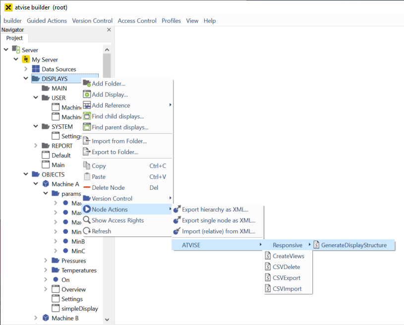
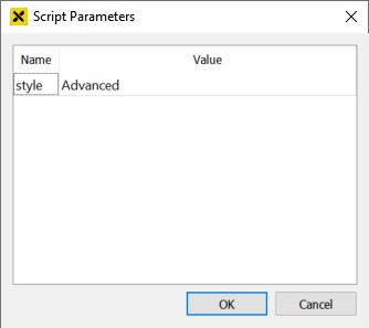
When the script is called, a prompt will appear which asks for the style of the generated default displays. The following styles are supported: "Advanced", "Standard" and "Steelblue". If another value is passed for the "style" parameter, the script will throw an error message.
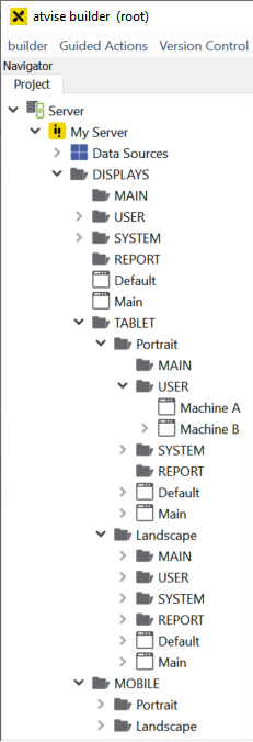
After successful execution of the script, the folders "TABLET" and "MOBILE" will be found in your display folder. In each of these new folders you will find the two sub-folders "Landscape" and "Portrait":
Hint
If the sizes of the respective default displays should be changed, this must be done before the first execution of the script. The displays that are used as default are defined in the following path: Library -> ATVISE -> Object Displays -> Responsive -> TABLET / MOBILE. If the size of the iFrame has been changed, the properties "atv:contentwidth" and "atv:contentheight" must be adjusted to the size of the iFrame in the display code. These properties will be used for all created displays included in the sub-folders.
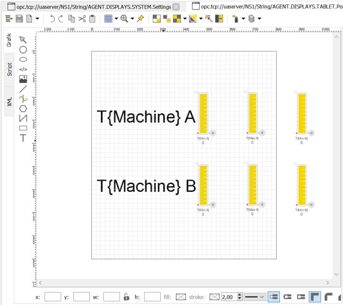
The existing displays will be copied to the responsive structure (TABLET and MOBILE) with adapted display sizes. You can now adjust the displays manually and check if all elements are in the visible area of the display.
Original display:

Tablet Portrait mode display:
If a display is subsequently added, the respective display for TABLET and MOBILE can be created by executing the Menu Script again. The already existing displays in the TABLET and MOBILE structure will not be overwritten.
The framework can be (de-)activated at any time by setting "responsiveLite" in the Configuration.
The configuration of the Responsive Design Lite is now complete and will be used after a browser reload.
Hint
The menu navigation of the visualization is also always created for "TABLET" and "MOBILE" based on the structure of the standard area (DISPLAYS, MAIN, USERS, SYSTEM, REPORT). The structure must therefore always be identical.