Highcharts Trend
The chart components are based on the "Highcharts" library and replace the previously available EJSCharts trend.
In the project tree and the library beneath the design area in atvise builder the folder "ATVISE" can be found. Therein every style (in the project tree below the folder "Object Displays") contains the sub folder "highcharts" which contains several object displays for creating customized chart variants. On right-click on an object display the relevant help sheet is opened, where a detailed description will help you choosing the right display for your purpose.
Hint
Please refer to the help page of the respective object display for a more detailed description of setting options.
The chart can view live and historic (only with atvise scada) data simultaneously. To view historized data of a certain time period, the nodes to be acquired have to be defined as described in chapter Add Archive Group.
Zoom
It is possible to zoom in the live and historic data of a chart. Click and hold the left mouse button to select the specific area. Depending on the selected zoom type, the interval of one or both axes is changed according to the selected area. In case of data mode archive only, the selected time period is also displayed by the From and Until elements of the time range selector. Zooming is also possible by using the mouse wheel. Use the Reset zoom button in the top right corner of the chart to display the default view.
Panning the displayed area is possible with the left mouse button while pressing and holding the Shift key. Use the Recenter view button in the top right corner of the chart to reset the view.
Pan
Main display
The main display with its modules is the most considerable part. This object display joins several objects of the "highcharts" folder together. It consists of the "Chart container" (the chart view), the "Legend table" (shows the data sets), the "Toolbar" and the "Time Range Selector".
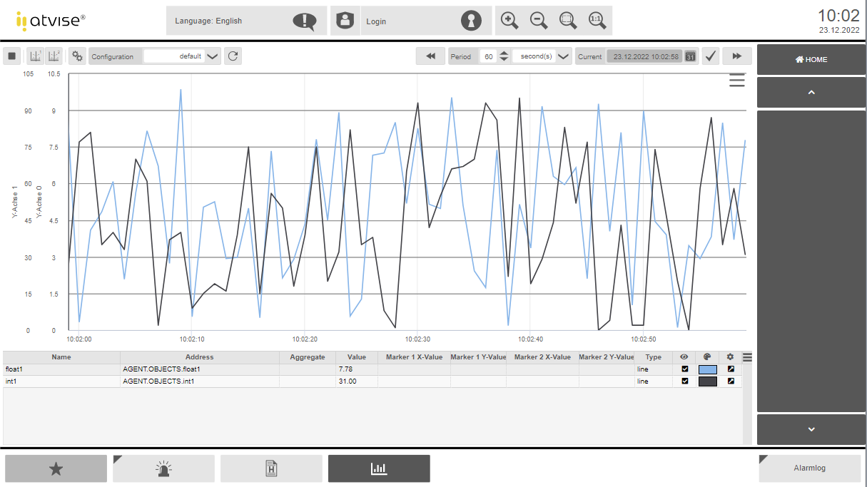
Chart container
The "Chart container" displays a chart and the raw or aggregate values of a node. The nodes are added by display parameters in atvise builder or by using the configuration dialog. This display can be used alone or in combination with the displays "Toolbar", "Time Range Selector" and/or "Legend Table".
Clicking  shows a menu that allows to print or download the diagram:
Print chart – Prints the currently shown diagram.
Download PNG image – Downloads the currently shown diagram as PNG image.
Download JPEG image – Downloads the currently shown diagram as JPEG image.
Download PDF document – Downloads the currently shown diagram as PDF document.
Download SVG vector image – Downloads the currently shown diagram as vector image.
Download CSV – Downloads a CSV file that contains all currently displayed data points and corresponding timestamps.
Download XLSX – Downloads an XLSX file that contains all currently displayed data points and corresponding timestamps.
Hint
The menu can be hidden or disabled by using the respective display parameters and setting appropriate rights (see Chart container - parameter "export menu" and "necessary right for export" or Main display - parameter group "Security: export menu". This may be necessary e.g. if a browser does not support or allow file downloads.
Legend table
The legend table shows information about the data presented in the chart in the form of a table. Important settings such as color and visibility can be altered here directly. The value corresponds to the last depicted datapoint in the chart. To see values in the past, set the node to Non-stop in the configuration of the chart.
Toolbar
This display provides tools for controlling the chart. It allows to control the view mode (live or archived data), the visibility of both measurement cursors and to open the configuration dialog.
Time range selector
Depending on the view mode, this display allows to define a time range for displaying archived data or a period in which live data is shown.
Configuration dialog
The configuration dialog consists of several displays. The "Top display" acts as main display and offers the possibility to change between the following displays: "Data", "X-Axis", "Y-Axis ", "General" and "Load / Save". There is also a smaller version of the highcharts configuration dialog with reduced configurability, optimized for devices with small displays (e.g. tablets and mobile phones).
The configuration dialog offers the possibility to make changes directly in the visualization. Changes made in the configuration dialog are directly applied to the chart instance and can be viewed by clicking the "Preview" button or pressing the F2 key on the keyboard. If a configuration is saved under a defined name in the "Load / Save" display, it will be available to all users and across all systems. Alternatively, the most important settings can also be edited via the parameters in the atvise builder (limited to line charts). The configuration dialog can be opened via the "Toolbar" display, therefore the parameters of the "Toolbar" and the "Chart container" have to be linked to the same chart name.
Data
The chart types "Line/Area" and "Column" can be chosen in different forms within the "Data" display. A pie chart is currently not supported.
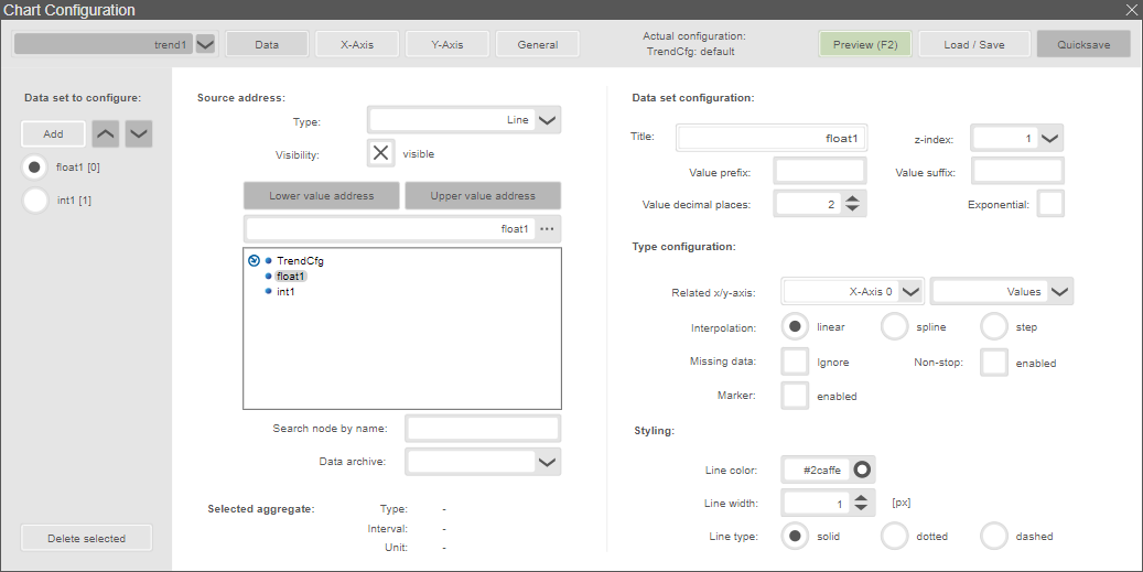
Data set to configure:
Add – Adds a new record at the end of the record selection.
Data set selection – Selection area for the current record.
Delete selected – Deletes the selected record.
Source address (of the selected data set):
Type – Defines the display type (line, spline, area, area with splines, two-line area, two-line area with splines, column).
Visibility – Enables or disables the display of the record.
Address selection area – In the selection area for the address, the data point can be selected, entered or searched (Search node by name). In case of an two-line area, two addresses must be selected - one address for the lower (Lower value address) and one for the upper (Upper value address) line or border.
Data archive – Name of archive that will be used for displaying historical values. This parameter is optional and particularly relevant for Portal users and custom WebMI implementations, using more than one archive group per node. It is disabled if the user has insufficient rights for reading the archive groups or only one archive group is assigned to the node.
Selected Aggregate – Shows the information type, interval and unit of the selected aggregate.
Data set configuration:
Title – Name of the record to be displayed (default: node name).
z-Index – Defines the order of the data sets in the chart.
Value prefix – Prefix that is added at the beginning of the shown value in the tooltip and legend.
Value suffix – Suffix that is added at the end of the shown value in the tooltip and legend.
Value decimal places – Defines the number of displayed decimal places in the tooltip and legend.
Exponential – If enabled, the values of this data set in the tooltip and legend are displayed in exponential notation. The number of displayed decimal places also affects the represented value.
Type configuration:
The available settings depend on the selected display type.
Related x/y-axis – Defines the related x- and y-axes for the current data set.
Interpolation – Specifies the interpolation method: linear, spline and step (not available for type Column).
Missing data – Defines if missing data points are ignored and shown as gap or connected lines (not available for type Column).
Non-stop – The line will be extended beyond the first and the last visible data points (not available for type Column).
Marker – Enables the display of the data points (not available for type Column).
Styling:
The available settings depend on the selected display type.
Line color – Defines the color of the line (not available for type Column).
Line width – Defines the width of the line (not available for type Column).
Line type – Defines the type of the line: solid, dotted or dashed (not available for type Column).
Fill color – Defines the fill color of an area resp. the column or bar (not available for types Line and Spline).
Border color – Defines the color of the border line of the column or bar (only available for type Columns).
Border line width – Defines the width of the border line (only available for type Columns).
Labels – Enables or disables the visibility of the labels (only available for type Columns).
Label format – Format of the label, for more information check the Highcharts API reference (only available for type Columns).
X-Axis
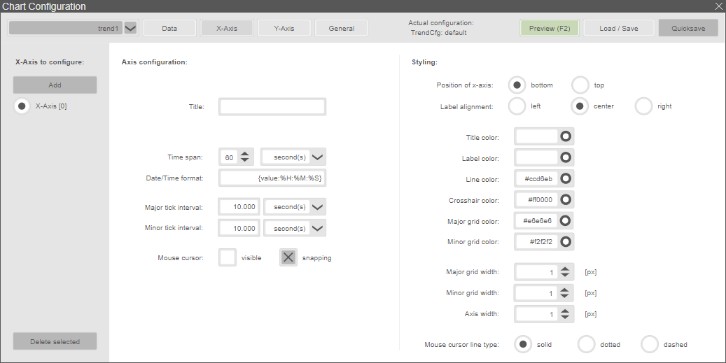
X-Axis to configure:
The X-axis is predefined and cannot be deleted. Adding another X-axis is not possible.
Axis configuration:
Title – Displayed title of the axis.
Time span – Value of the time span and unit to be displayed.
Date/Time format – Format of the date output (default: "% H:% M:% S").
Major tick interval – Interval of the main auxiliary grid for orientation.
Minor tick interval – Interval of the auxiliary grid for orientation aid.
Mouse cursor
visible – Crosshairs visible, show line on the axis.
snapping – Snap to the nearest data point.
Styling:
Position of x-axis – Position of the axis (bottom/top).
Label alignment – Horizontal alignment of the axis labels (left, centered or right).
Title color – Color of the axis title (hex code).
Label color – Color of the axis labels (hex code).
Line color – Represented color of the axis (hex code).
Crosshair color – Color of the crosshair (hex code).
Major grid color – Color of the main grid lines (hex code).
Minor grid color – Color of auxiliary grid lines (hex code).
Major grid width – Line width of the main grid lines (in pixels).
Minor grid width – Line width of auxiliary grid lines (in pixels).
Axis width – Line width of the axis (in pixels).
Mouse cursor line type – Used line type of crosshair.
Y-Axis

Y-Axis to configure:
Add – Adds a new Y-axis at the end of the selection area.
Selection area – Allows to select a Y-axis for configuration.
Delete selected – Delete the selected y-axis.
Axis configuration:
Title – Displayed title of the axis.
Axis label format – Defines a format string for the axis label (see highcharts API reference). E.g.: {value:.2f} mm shows only 2 decimal places and "mm" as unit in the axis label.
Auto scale – Automatic scaling of the upper and lower limits. Can only be enabled for scale type linear.
Minimum – Lower limit displayed (values below are not displayed).
Maximum – Upper limit displayed (values above are not displayed).
Hint
"Automatic tick alignment is active" indicates that the defined minimum or maximum values may be automatically adjusted for a proper tick alignment (see Tick auto alignment in the general settings).
Visibility – Enable / disable the visibility of the axis.
Scale type – Scaling of the axis (linear / logarithmic).
Major tick interval – Interval of the main auxiliary grid for orientation.
Minor tick interval – Interval of the auxiliary grid for orientation aid.
Mouse cursor
visible – Crosshairs visible, show line on the axis.
snapping – Snap to the nearest data point.
Styling:
Position of y-axis – Position of the axis (left/right).
Label alignment – Horizontal alignment of the axis labels (left, centered or right).
Offset of y-axis – Defines the horizontal offset of the axis label. This parameter should be set depending on the position of the y-axis, e.g. 15 if position of y-axis = right or -15 if position of y-axis = left.
Title color – Color of the axis title (hex code).
Label color – Color of the axis labels (hex code).
Line color – Represented color of the axis (hex code).
Crosshair color – Color of the crosshair (hex code).
Major grid color – Color of the main grid lines (hex code).
Minor grid color – Color of auxiliary grid lines (hex code).
Major grid width – Line width of the main grid lines (in pixels).
Minor grid width – Line width of auxiliary grid lines (in pixels).
Axis width – Line width of the axis (in pixels).
Mouse cursor line type – Used line type of crosshair.
General
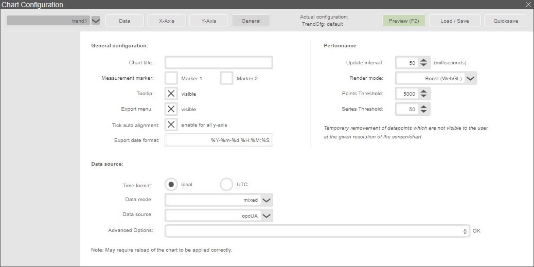
General configuration:
Chart title – Title of the chart.
Measurement marker – Enable or disable the two measurement cursors.
Tooltip – Show or hide tooltips for the data points in the chart.
Export menu – Show or hide the export menu on the top right side.
Tick auto alignment – This option allows to align the ticks to improve the clarity of the chart in case of several Y-axes.
Export date format – The date format that is used when exporting data to a CSV or an XLSX file (default: %Y-%m-%d %H:%M:%S). See https://api.highcharts.com/class-reference/Highcharts.Time for more information on the format string.
Data source:
Time format – Defines the time format of the data shown in the chart.
Data mode – The data mode defines which data is initially shown after opening the display or loading a configuration. It is possible to switch between live and archived data in the chart afterwards without changing the data mode configured here.
live only – Only live data is shown initially (archived data can be loaded if you move backward in time).
archive only – Only archived data is shown initially (live data can be shown by clicking the Start button).
mixed – Live and archived data is loaded and shown at once.
Data source – Defines the data source module which is used to import data (see Integrating Scope 3 into atvise for further information on integrating other data sources).
Advanced Option – Allows to set user-defined parameters for specific data sources. Parameters can be defined as strings or JSON strings. A JSON string must be embedded in {} and its validity is automatically checked. In case of a syntax error, the text "INVALID JSON" is shown next to the text box instead of "OK".
Performance:
Update Interval – Time in milliseconds between adding new data to the chart.
Render mode – Allows to configure render settings for the highcharts.
Default (SVG) – Data is rendered by SVG, i.e. all values are used.
Boost (WebGL) – Changes the rendering mode depending on Points Threshold and Series Threshold. If either the defined threshold of data points or series is reached, the data is rendered by WebGL. If you set one of the thresholds to 1, Boost is always active. If you want to set only one threshold, set the other one to 0. To disable Boost, set both thresholds to 0.
Downsampling (SVG) – This option is used to get a performance boost, especially on low-end devices. It reduces the number of rendered data points depending on the currently displayed time range and the chart size. Using downsampling, only the min and max values of every sampling period (= displayed time range divided by chart width in pixels) are determined and displayed in the chart. The Sampling factor allows to increase the sampling period. Thus, fewer data points are rendered and shown in the chart.
Example: A time range of 3600 Minutes is displayed in a chart with a width of 1200 pixels. This results in a sampling period of 3 minutes (3600 minutes divided by 1200 pixels). Only the min and max values from every sampling period are determined and shown in the chart. If the Sampling factor is increased from 1 (default) to 5, the min and max values are determined for a sampling period of 15 minutes.
Points Threshold – If the defined number of data points is reached, the data is rendered by WebGL. If set to 1, Boost is always active. Set this threshold to 0 to enable only the series threshold. If both threshold are 0, Boost is disabled.
Series Threshold – If the defined number of series is reached, the data is rendered by WebGL. If set to 1, Boost is always active. Set this threshold to 0 to enable only the points threshold. If both thresholds are 0, Boost is disabled.
Load / Save
The configuration can be saved to a specified node address or a file on the server (defined in atvise builder). The file saving method is recommended for systems with limited node content length. The server-side method for file writing has to be provided by the user. In addition, an optional compression of the configuration can be activated in the display parameters in the atvise builder.
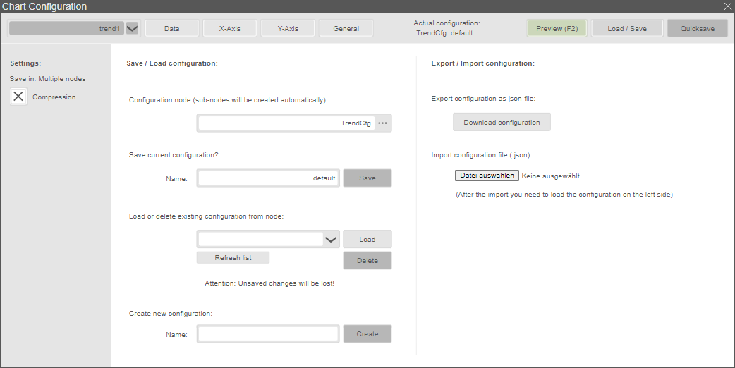
Additionally the configuration is saved under the name "autosave" after each alteration. This protects against configuration losses at possible system crashes. By using the "Quicksave" button the current configuration is saved under the specified node with the specified name (specified in the display parameters).
Hint
Configurations with the same name on this node will be overwritten.
Settings:
Save in – Shows the selected saving method.
Compression – Determines whether the data is to be compressed when saving. This option must be enabled in the builder by setting the display parameter change compression to true.
Save / Load configuration:
Configuration node – Defines the data point in which the configuration is saved.
Save current configuration – Saves the specified configuration.
Load or delete existing configuration from node – Loading or deleting the selected configuration. Refresh list reloads the selection list.
Create new configuration – Creates a new configuration with the given name.
Export / Import configuration:
Export configuration as json file – Exports all configurations of the chart to a json file.
Import configuration file – Imports all configurations for the chart from a json file. After one or more configurations are imported from a file, the configuration of your choice has to be loaded to be active.
Hint
Further information for highcharts can be found on https://www.highcharts.com. The highcharts API reference documentation can be downloaded here: https://code.highcharts.com/zips/Highcharts-7.1.1.zip
Extended developer documentation for the atvise specific API of the integration of highcharts with a description of the classes and modules (trendFactory, MeasuringCursor, DataHandler, Datasource, Legend, Renderer, Utils) is available on request from the sales or support team.